Dark mode
ZOMATO · 2024
MY ROLE
Research, Colour system exploration, Token architecture, Interaction design, Cross-team coordination, Rollout planning, Quality control
TEAM
2 iOS devs, 2 Android devs, Backend engineers from multiple teams
TIMELINE
Jul - Sep 2024 (3 months)
Why we built it
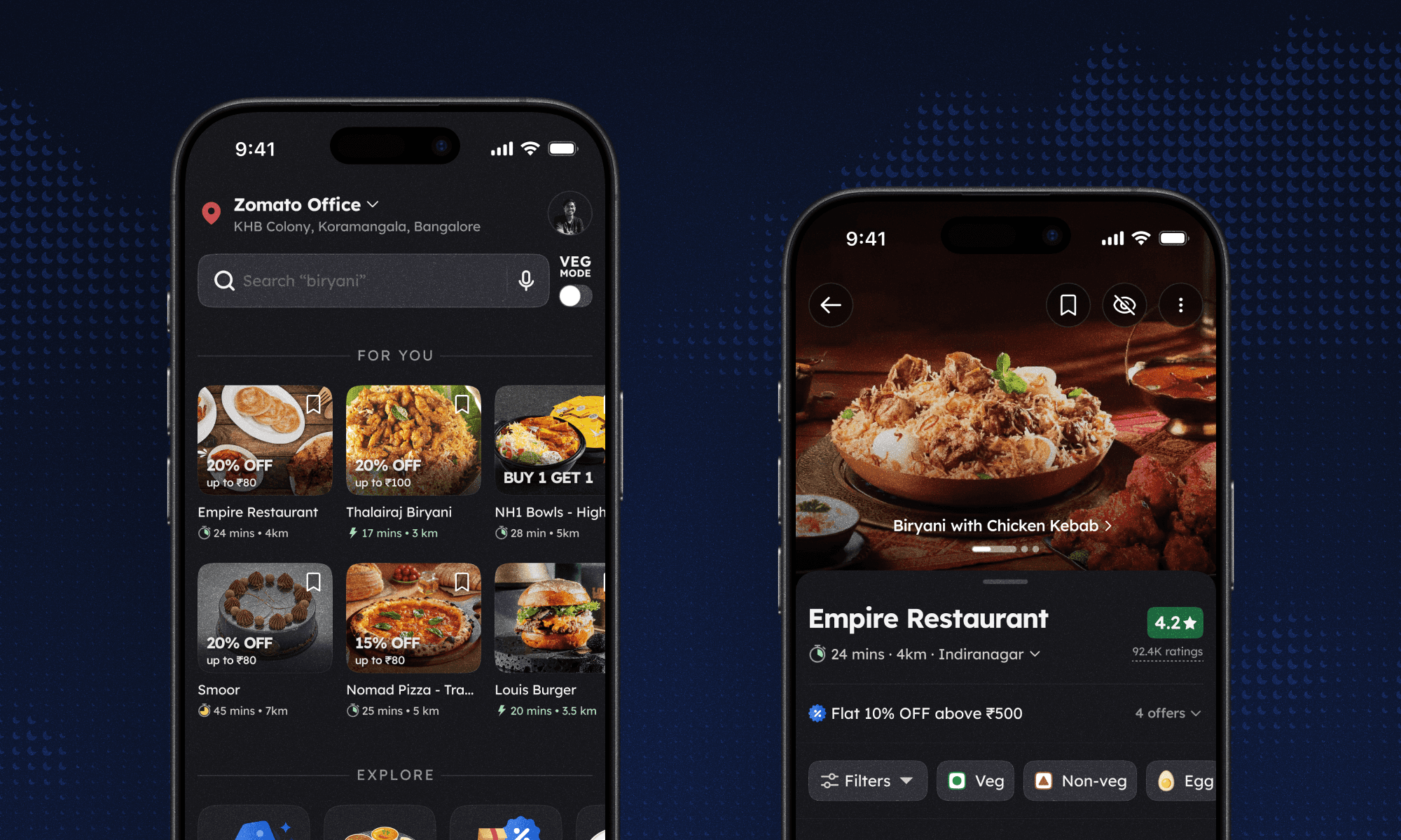
Dark mode came from a simple goal: giving customers more control over how the app feels. Many people simply prefer a darker interface, especially at night, and giving them that choice was a way to make the app feel more like theirs. It was also one of the most requested features from our users, who had been asking for it for years across Reddit, X, and other social platforms.
The system problem to solve first
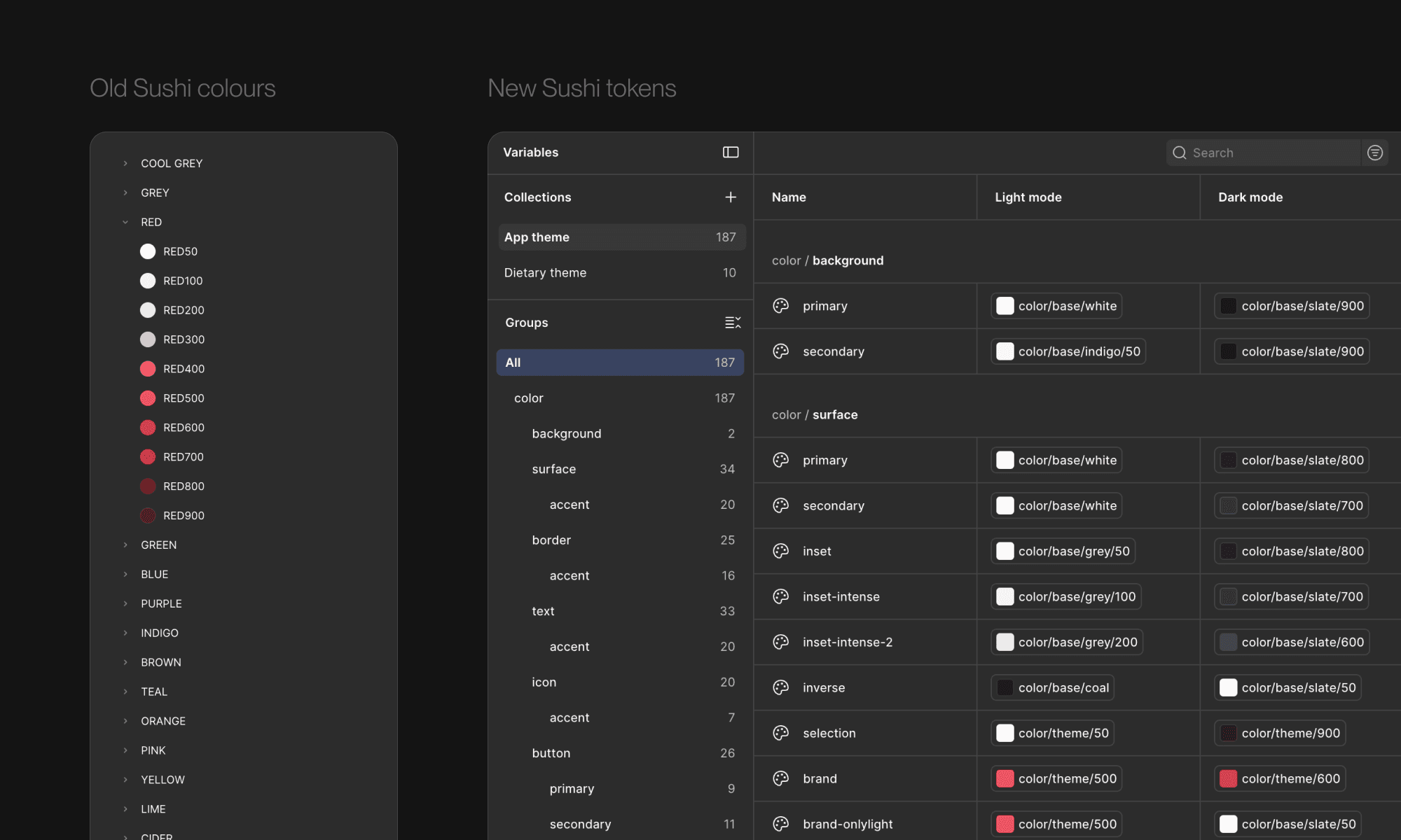
Before dark mode, Zomato ran on a style-based design system. Flat lists of colours like Red50, Red100, Grey900, with no semantic meaning attached. Because nothing defined which value to use where, different designers often reached for different colours for the same thing, and inconsistencies crept across the app. And the moment we tried to add a second theme, the whole approach fell apart.
A single "white" in the old system could mean many different things: the app background, a card sitting on that background, an input field within the card. In light mode they all read the same. In dark mode they need to be different values so the layering still works. Without semantic meaning attached to colour, there was no way to know which "white" should become which shade of dark.
So dark mode began with a system rebuild. Colours moved from raw palettes to semantic tokens, each with a name that described its role and multiple values behind it, one per theme. This became the foundation for Sushi, our design system.
Designing the dark theme
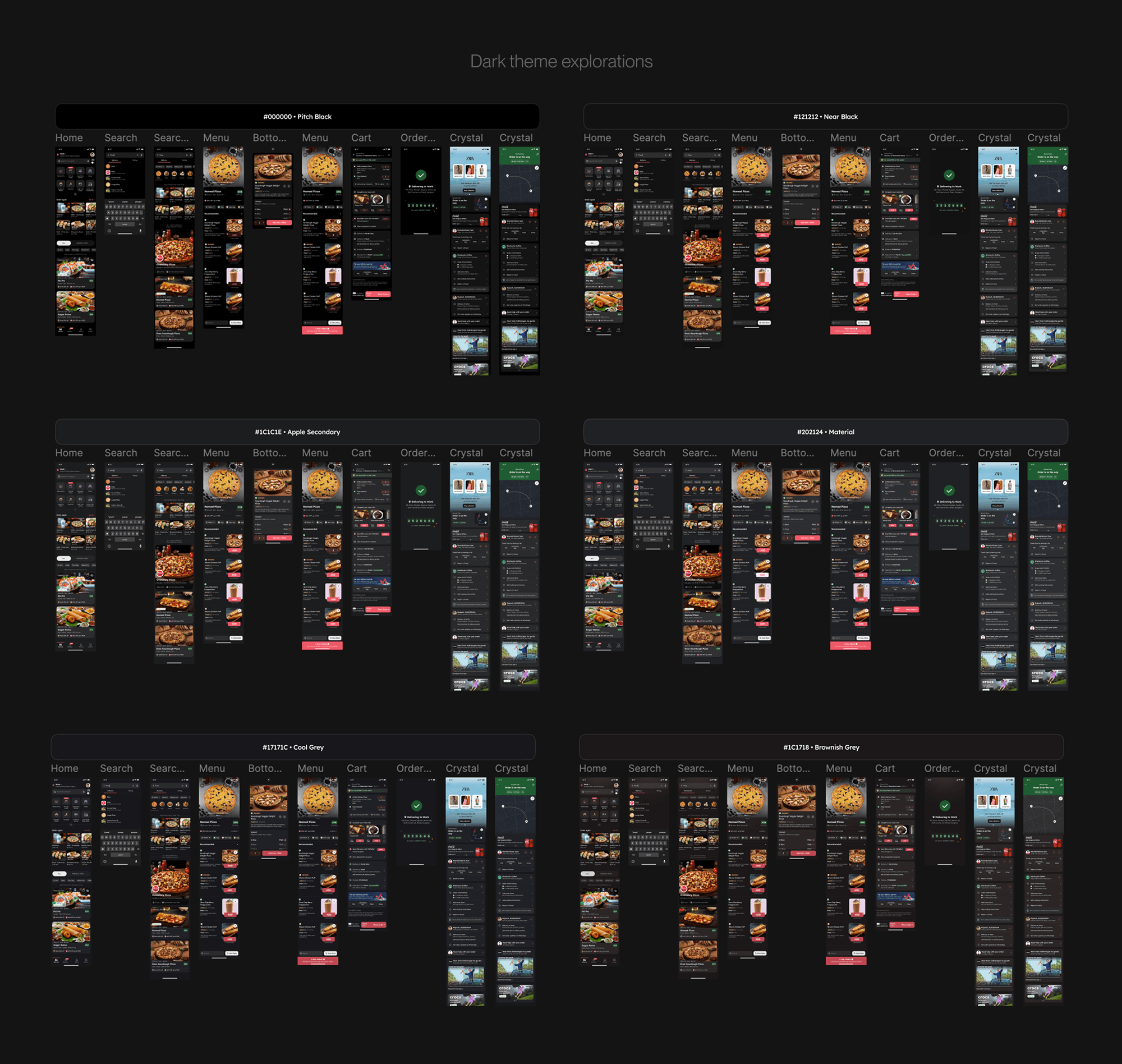
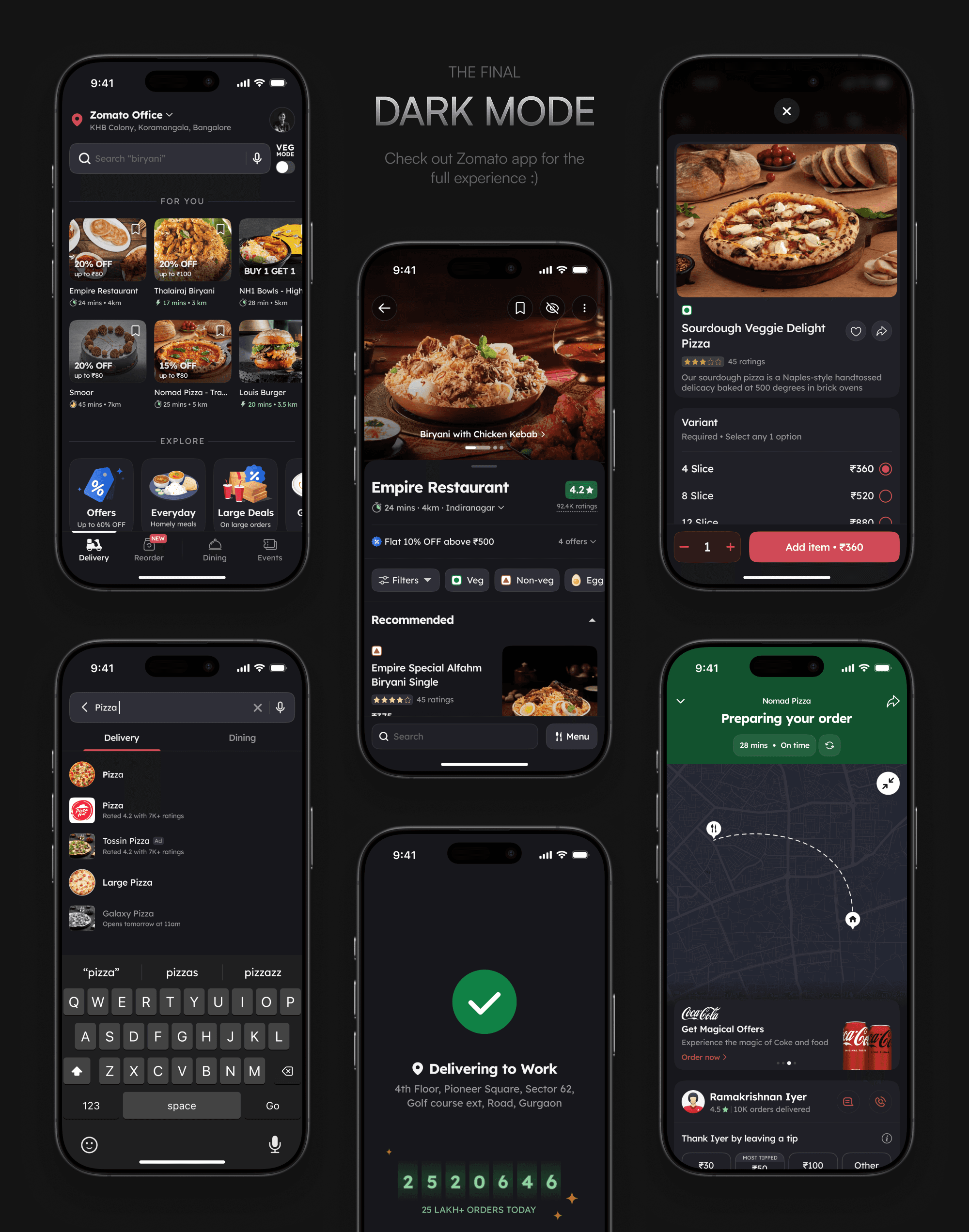
With the token structure settled, the real design question opened up: what should dark mode actually feel like? Every option carried a feeling. Bluish greys ran cold and clinical. Warmer greys muddied the food. Pure black was too harsh against the imagery and flattened all sense of depth. After a lot of time on the wall, we landed on a cool grey we called "slate," dark enough to recede but soft enough to let the food and the brand sit naturally on top.
Brand red carried its own decision. Zomato's signature red is bright, and at that saturation on a dark surface it flares. We darkened it just enough to meet contrast and legibility standards without losing the identity.
The one thing we didn't touch: food photography. Dish images and restaurant hero shots stay unaltered across themes. Recolouring or tinting food is a fast way to make it look unappetising, and customers deserve to see the real thing before they order.
A handful of custom illustrations and icons did need theme-aware variants, so we built a way to serve different assets based on the active theme. That kept them from standing out awkwardly against the dark surface while food stayed authentic.
Rolling out
A partial dark mode, where some screens are themed and others aren't, feels broken in a way that no amount of good design on the themed screens can fix. So every surface of the app had to be covered, and ready at the same time.
The team was two iOS and two Android engineers, plus backend teams who owned services feeding different parts of the app. I tested builds at each checkpoint to catch surfaces that had been missed or had slipped back to light values.
Once everything was ready, we released it in stages, starting at 30% of users and reaching everyone within a few days.
Why we built it
Dark mode came from a simple goal: giving customers more control over how the app feels. Many people simply prefer a darker interface, especially at night, and giving them that choice was a way to make the app feel more like theirs. It was also one of the most requested features from our users, who had been asking for it for years across Reddit, X, and other social platforms.
The system problem to solve first
Before dark mode, Zomato ran on a style-based design system. Flat lists of colours like Red50, Red100, Grey900, with no semantic meaning attached. Because nothing defined which value to use where, different designers often reached for different colours for the same thing, and inconsistencies crept across the app. And the moment we tried to add a second theme, the whole approach fell apart.
A single "white" in the old system could mean many different things: the app background, a card sitting on that background, an input field within the card. In light mode they all read the same. In dark mode they need to be different values so the layering still works. Without semantic meaning attached to colour, there was no way to know which "white" should become which shade of dark.
So dark mode began with a system rebuild. Colours moved from raw palettes to semantic tokens, each with a name that described its role and multiple values behind it, one per theme. This became the foundation for Sushi, our design system.
Designing the dark theme
With the token structure settled, the real design question opened up: what should dark mode actually feel like? Every option carried a feeling. Bluish greys ran cold and clinical. Warmer greys muddied the food. Pure black was too harsh against the imagery and flattened all sense of depth. After a lot of time on the wall, we landed on a cool grey we called "slate," dark enough to recede but soft enough to let the food and the brand sit naturally on top.
Brand red carried its own decision. Zomato's signature red is bright, and at that saturation on a dark surface it flares. We darkened it just enough to meet contrast and legibility standards without losing the identity.
The one thing we didn't touch: food photography. Dish images and restaurant hero shots stay unaltered across themes. Recolouring or tinting food is a fast way to make it look unappetising, and customers deserve to see the real thing before they order.
A handful of custom illustrations and icons did need theme-aware variants, so we built a way to serve different assets based on the active theme. That kept them from standing out awkwardly against the dark surface while food stayed authentic.
Rolling out
A partial dark mode, where some screens are themed and others aren't, feels broken in a way that no amount of good design on the themed screens can fix. So every surface of the app had to be covered, and ready at the same time.
The team was two iOS and two Android engineers, plus backend teams who owned services feeding different parts of the app. I tested builds at each checkpoint to catch surfaces that had been missed or had slipped back to light values.
Once everything was ready, we released it in stages, starting at 30% of users and reaching everyone within a few days.
Why we built it
Dark mode came from a simple goal: giving customers more control over how the app feels. Many people simply prefer a darker interface, especially at night, and giving them that choice was a way to make the app feel more like theirs. It was also one of the most requested features from our users, who had been asking for it for years across Reddit, X, and other social platforms.
The system problem to solve first
Before dark mode, Zomato ran on a style-based design system. Flat lists of colours like Red50, Red100, Grey900, with no semantic meaning attached. Because nothing defined which value to use where, different designers often reached for different colours for the same thing, and inconsistencies crept across the app. And the moment we tried to add a second theme, the whole approach fell apart.
A single "white" in the old system could mean many different things: the app background, a card sitting on that background, an input field within the card. In light mode they all read the same. In dark mode they need to be different values so the layering still works. Without semantic meaning attached to colour, there was no way to know which "white" should become which shade of dark.
So dark mode began with a system rebuild. Colours moved from raw palettes to semantic tokens, each with a name that described its role and multiple values behind it, one per theme. This became the foundation for Sushi, our design system.
Designing the dark theme
With the token structure settled, the real design question opened up: what should dark mode actually feel like? Every option carried a feeling. Bluish greys ran cold and clinical. Warmer greys muddied the food. Pure black was too harsh against the imagery and flattened all sense of depth. After a lot of time on the wall, we landed on a cool grey we called "slate," dark enough to recede but soft enough to let the food and the brand sit naturally on top.
Brand red carried its own decision. Zomato's signature red is bright, and at that saturation on a dark surface it flares. We darkened it just enough to meet contrast and legibility standards without losing the identity.
The one thing we didn't touch: food photography. Dish images and restaurant hero shots stay unaltered across themes. Recolouring or tinting food is a fast way to make it look unappetising, and customers deserve to see the real thing before they order.
A handful of custom illustrations and icons did need theme-aware variants, so we built a way to serve different assets based on the active theme. That kept them from standing out awkwardly against the dark surface while food stayed authentic.
Rolling out
A partial dark mode, where some screens are themed and others aren't, feels broken in a way that no amount of good design on the themed screens can fix. So every surface of the app had to be covered, and ready at the same time.
The team was two iOS and two Android engineers, plus backend teams who owned services feeding different parts of the app. I tested builds at each checkpoint to catch surfaces that had been missed or had slipped back to light values.
Once everything was ready, we released it in stages, starting at 30% of users and reaching everyone within a few days.
Impact
Adoption hit around 21% within weeks of launch. Dark mode sessions showed a higher order-through rate and order value, but the same users had those numbers before switching too. High-intent users were simply the first to turn it on. What mattered was that every core funnel metric stayed green through the rollout.
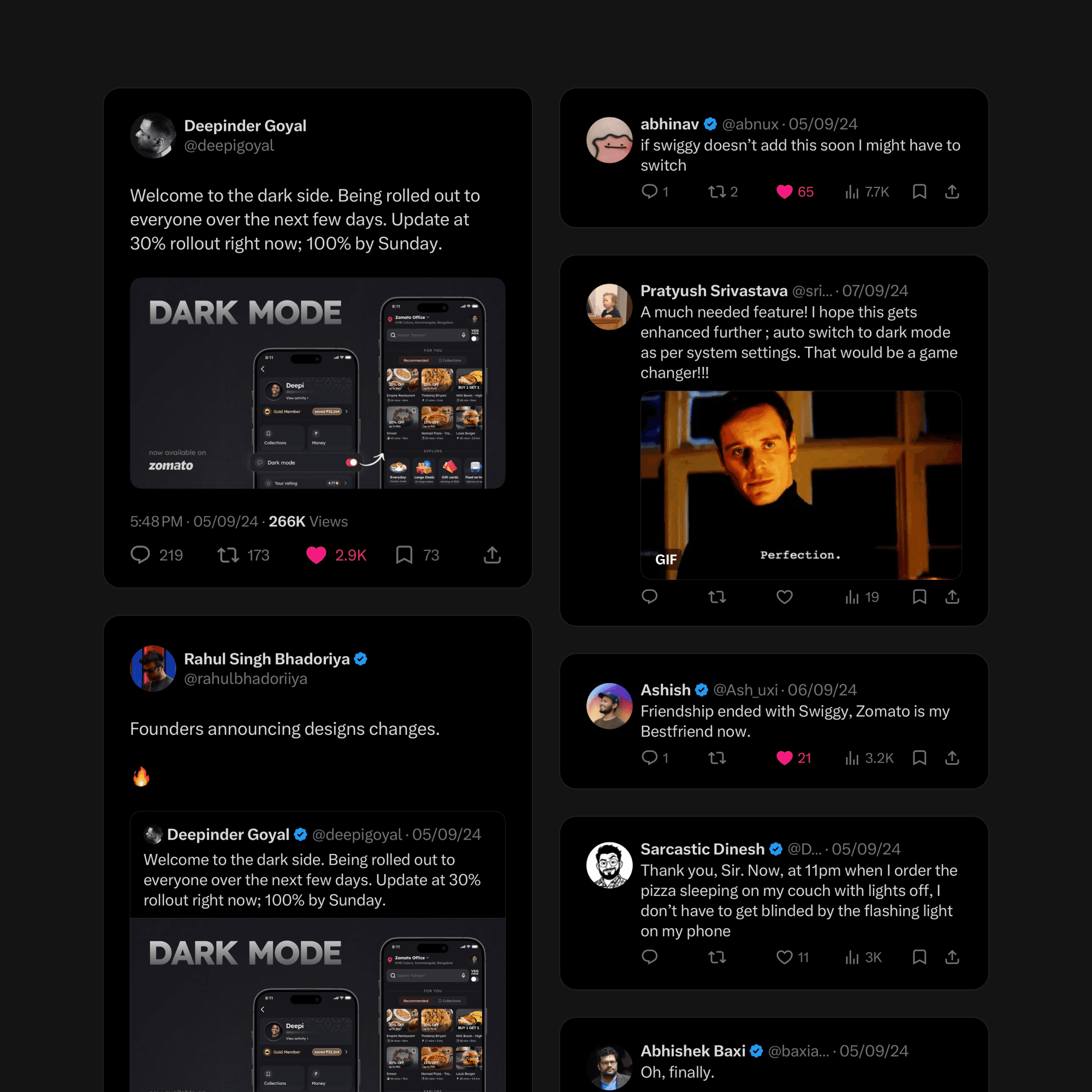
The launch was announced by Zomato's CEO, and the internet loved it. Years of pent-up demand poured into the replies the moment it landed.
21%
21%
Dark mode adoption
Metrics
Metrics
All core funnels stayed green
Beyond dark mode
The token system now supports additional theme dimensions like the dietary theme (veg mode), and the architecture I set up has since been adopted well beyond this project, across Blinkit, District, and Zomato's own merchant and rider apps.
Want to know more?
The full story has more detail than fits here - tradeoffs, dead ends and the stuff that didn't ship. Get in touch for a walkthrough.