Easier kitchen supply
HYPERPURE BY ZOMATO · 2023
MY ROLE
Research, Copywriting, High-fidelity prototype, Quality control
TEAM
1 Product Manager, Data Science, Engineering
TIMELINE
2023
The problem
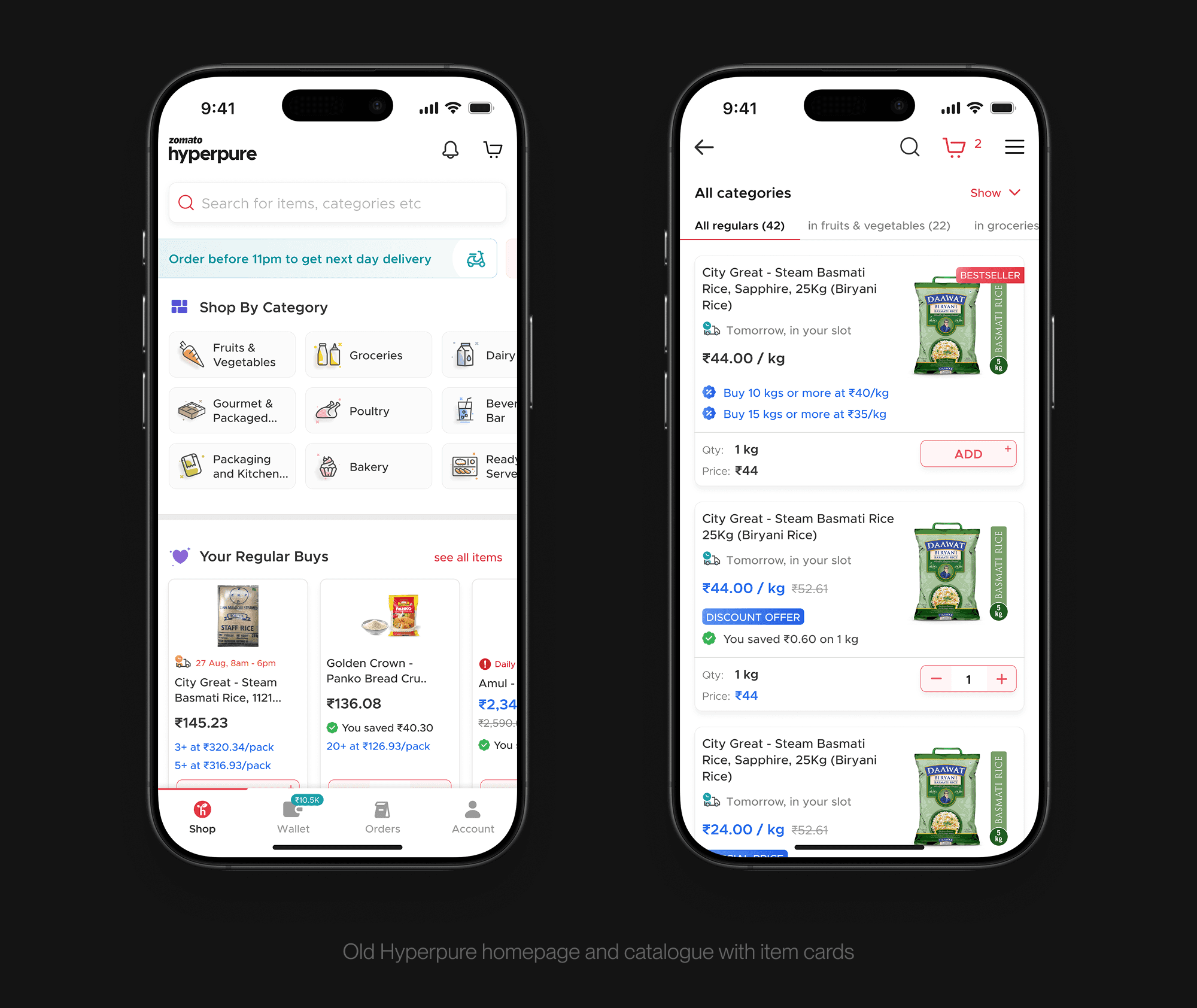
Restaurants on Hyperpure tend to settle into a pattern. They reorder the same narrow set of items week after week, even though Hyperpure stocks much of what they buy from other suppliers. Finding things wasn't the problem. They just weren't looking beyond their regulars.
Hyperpure also offers wholesale discounts on bulk orders, which we called QBP (Quantity Based Offers). The lower per-unit price kicks in once a restaurant orders past a certain quantity threshold. The old item card showed these tiers as small text under the price, easy to miss. And acting on one meant users had to do the math themselves and bump up the quantity manually.
The approach
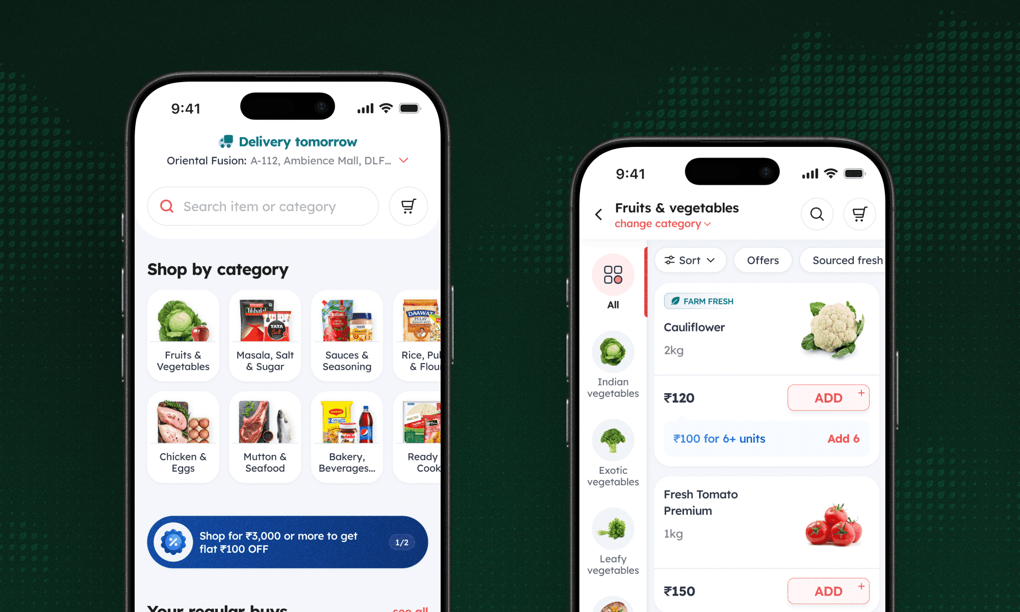
The redesign worked on two fronts. Turning bulk pricing from information into something users could act on directly, eliminating the friction of adding bulk amounts manually. And getting more of the catalogue in front of users across the homepage and listing pages, so they ran into things they wouldn't have searched for.
Designing the item card
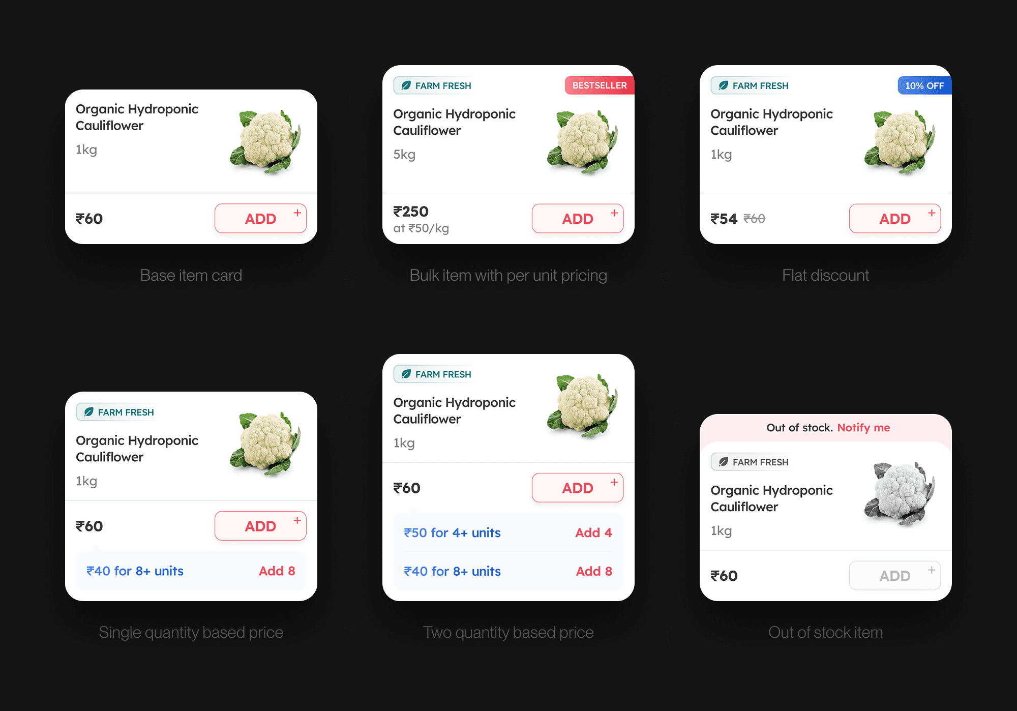
The item card carried most of the weight. A single card had to handle 14+ variants depending on the item's state and the offer attached to it: bestsellers, items with discount offers, items with one or two QBP tiers, trial offers, delivery delays, out of stock, launching soon, repeat buys, and similar products.
The most novel part was the QBP states. Where the tiers used to be just information, every one now has a quick-add CTA that jumps the quantity straight to the threshold, no manual bumping required. A restaurant ordering chicken can drop from ₹400/kg to ₹360/kg by tapping a single button. The card also had to handle progression through QBP tiers cleanly. As a user adds more units, the card shifts between prompts for the next savings threshold and confirmations of what they've already saved.

Surfacing cross -category opportunities
The home and category pages were restructured around discovery. The home page leads with category tiles and cross-category deal carousels, so users see what else is available before they default to their regulars. On the category page, a sub-category rail on the left lets users move within the current category, and category switching at the top makes it easy to jump to an adjacent one without backing all the way out.

The problem
Restaurants on Hyperpure tend to settle into a pattern. They reorder the same narrow set of items week after week, even though Hyperpure stocks much of what they buy from other suppliers. Finding things wasn't the problem. They just weren't looking beyond their regulars.
Hyperpure also offers wholesale discounts on bulk orders, which we called QBP (Quantity Based Offers). The lower per-unit price kicks in once a restaurant orders past a certain quantity threshold. The old item card showed these tiers as small text under the price, easy to miss. And acting on one meant users had to do the math themselves and bump up the quantity manually.
The approach
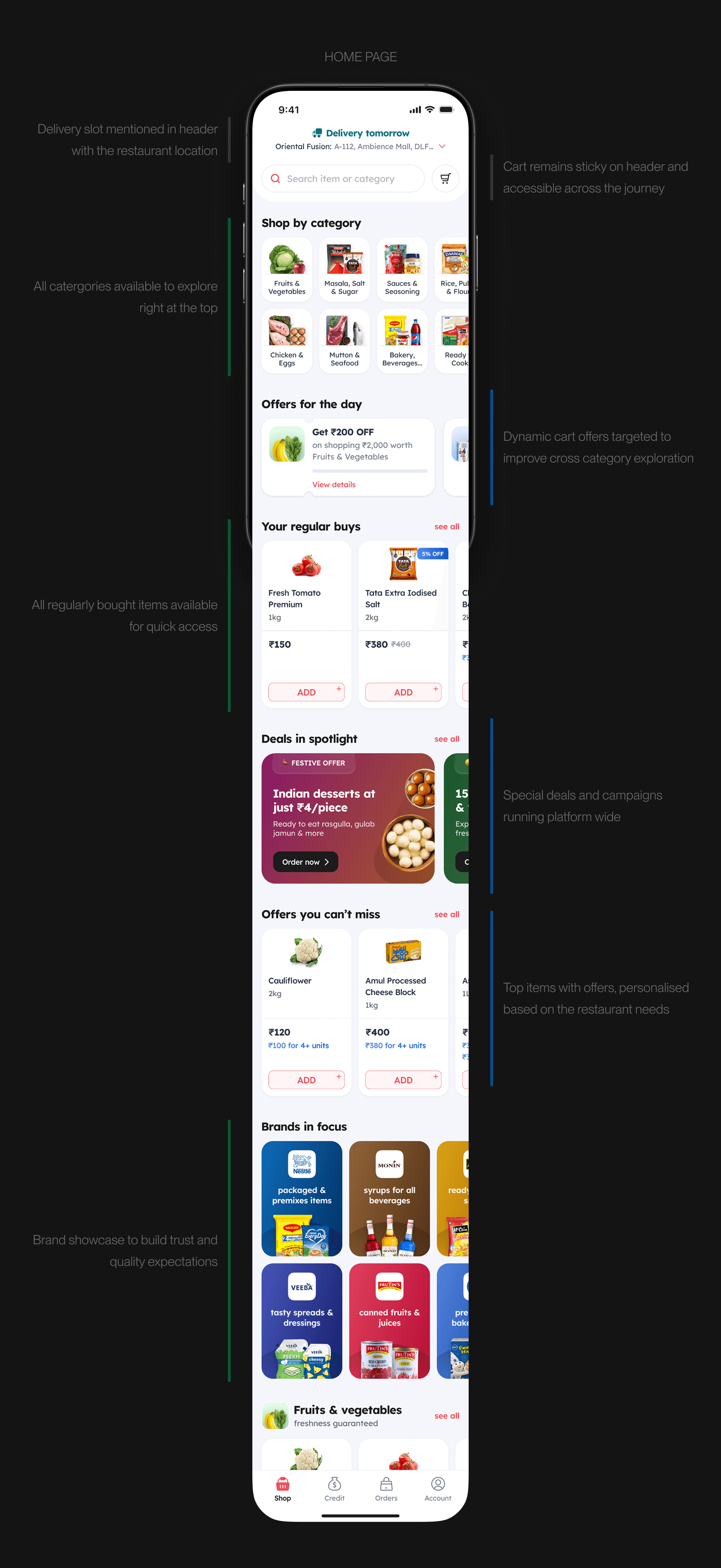
The redesign worked on two fronts. Turning bulk pricing from information into something users could act on directly, eliminating the friction of adding bulk amounts manually. And getting more of the catalogue in front of users across the homepage and listing pages, so they ran into things they wouldn't have searched for.
Designing the item card
The item card carried most of the weight. A single card had to handle 14+ variants depending on the item's state and the offer attached to it: bestsellers, items with discount offers, items with one or two QBP tiers, trial offers, delivery delays, out of stock, launching soon, repeat buys, and similar products.
The most novel part was the QBP states. Where the tiers used to be just information, every one now has a quick-add CTA that jumps the quantity straight to the threshold, no manual bumping required. A restaurant ordering chicken can drop from ₹400/kg to ₹360/kg by tapping a single button. The card also had to handle progression through QBP tiers cleanly. As a user adds more units, the card shifts between prompts for the next savings threshold and confirmations of what they've already saved.
Surfacing cross -category opportunities
The home and category pages were restructured around discovery. The home page leads with category tiles and cross-category deal carousels, so users see what else is available before they default to their regulars. On the category page, a sub-category rail on the left lets users move within the current category, and category switching at the top makes it easy to jump to an adjacent one without backing all the way out.
The problem
Restaurants on Hyperpure tend to settle into a pattern. They reorder the same narrow set of items week after week, even though Hyperpure stocks much of what they buy from other suppliers. Finding things wasn't the problem. They just weren't looking beyond their regulars.
Hyperpure also offers wholesale discounts on bulk orders, which we called QBP (Quantity Based Offers). The lower per-unit price kicks in once a restaurant orders past a certain quantity threshold. The old item card showed these tiers as small text under the price, easy to miss. And acting on one meant users had to do the math themselves and bump up the quantity manually.
The approach
The redesign worked on two fronts. Turning bulk pricing from information into something users could act on directly, eliminating the friction of adding bulk amounts manually. And getting more of the catalogue in front of users across the homepage and listing pages, so they ran into things they wouldn't have searched for.
Designing the item card
The item card carried most of the weight. A single card had to handle 14+ variants depending on the item's state and the offer attached to it: bestsellers, items with discount offers, items with one or two QBP tiers, trial offers, delivery delays, out of stock, launching soon, repeat buys, and similar products.
The most novel part was the QBP states. Where the tiers used to be just information, every one now has a quick-add CTA that jumps the quantity straight to the threshold, no manual bumping required. A restaurant ordering chicken can drop from ₹400/kg to ₹360/kg by tapping a single button. The card also had to handle progression through QBP tiers cleanly. As a user adds more units, the card shifts between prompts for the next savings threshold and confirmations of what they've already saved.
Surfacing cross -category opportunities
The home and category pages were restructured around discovery. The home page leads with category tiles and cross-category deal carousels, so users see what else is available before they default to their regulars. On the category page, a sub-category rail on the left lets users move within the current category, and category switching at the top makes it easy to jump to an adjacent one without backing all the way out.
Impact
The numbers moved on both fronts. More restaurants took up bulk pricing, more of them ordered products they hadn't bought before, and order values went up across the board.
56%
56%
Bulk offer uptake
40%
40%
New products ordered
18%
18%
18%
Average order value
Want to know more?
The full story has more detail than fits here - tradeoffs, dead ends and the stuff that didn't ship. Get in touch for a walkthrough.