Meals under your budget
ZOMATO · 2025

MY ROLE
Research, Copywriting, High-fidelity prototype, Motion design, Component & states framework, Quality control
TEAM
1 Product manager, 1 Visual designer, Data science, Engineering
TIMELINE
Sep 2025 (1 month)
The problem
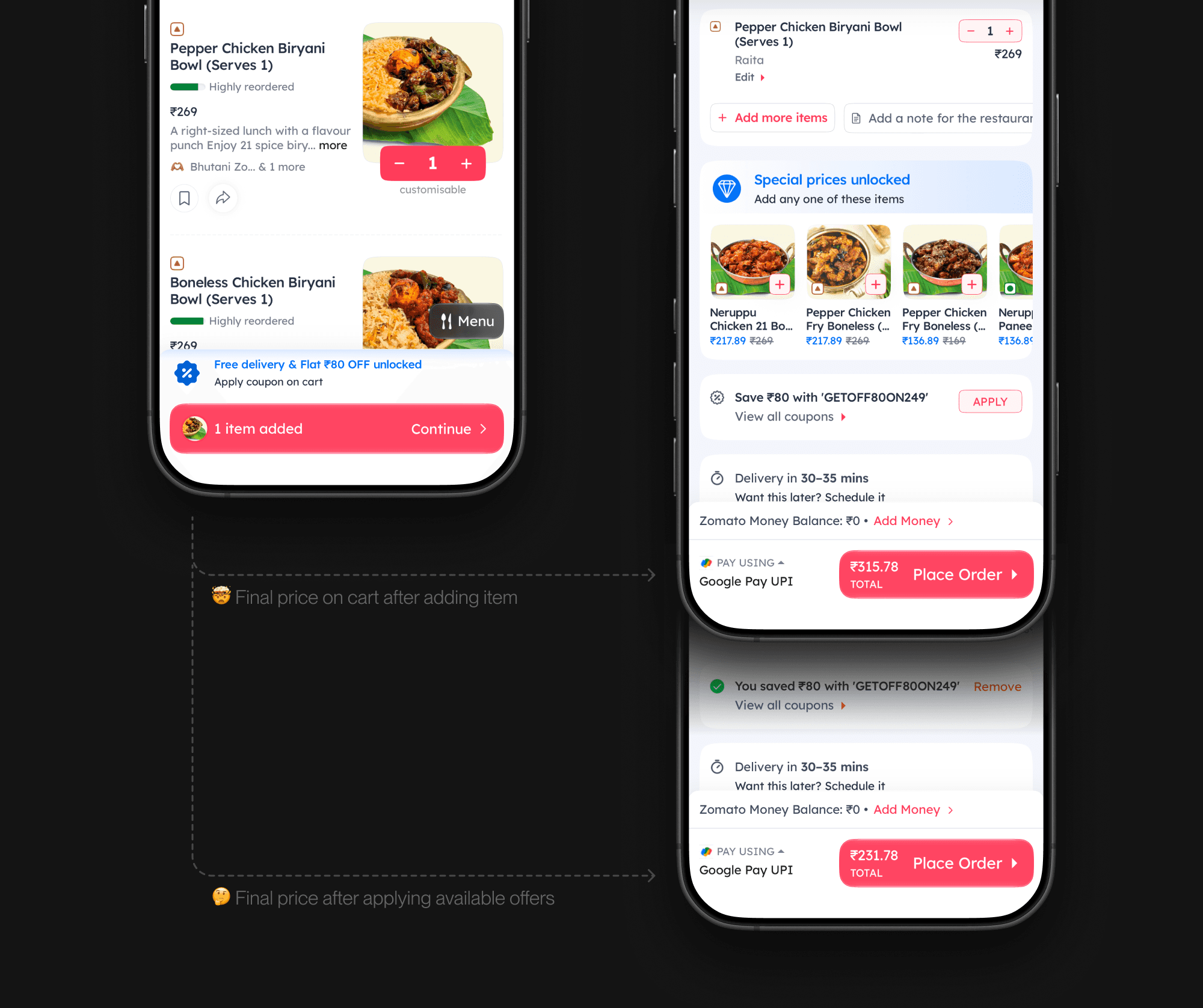
Price-sensitive users were dropping off after browsing. Not because nothing was affordable, but because they couldn't tell what they'd actually pay until the very end, once taxes, delivery, fees, and offers were all applied at checkout.
We noticed a clear pattern of cart-hopping. Price sensitive users would open a restaurant, add items, go to the cart, and apply offers, just to see the final total. Then they would do the same at the next restaurant. And the next, creating multiple carts. They were comparing prices the hard way, rebuilding their order again and again until they either checked out from one of the carts or gave up.
The hypothesis was that taking price out as a factor in the decision-making process would give users one less thing to worry about while choosing what to order, making them more likely to convert.
The idea
We wanted to show people complete carts under a set budget, priced exactly as they'd pay with taxes and offers included. The curation had to favour the best value cart that still fit, so affordability wouldn't come at the cost of order value, and if nothing fit at all, the idea was to nudge users up a price band rather than leave them at a dead end.
Set your budget
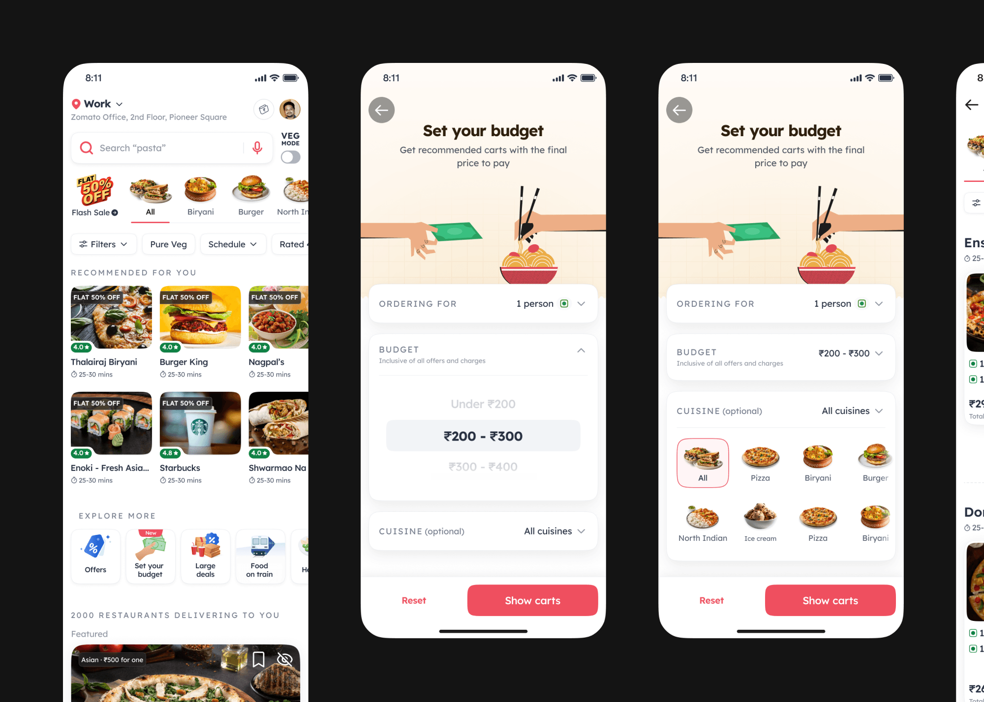
The first direction was more ambitious. Users would pick their own budget, how many people they were ordering for, and the cuisines they were in the mood for, and we would put together carts that fit all of it. A set-your-own-budget flow, with the customer in full control of the inputs.
Designing the cart card
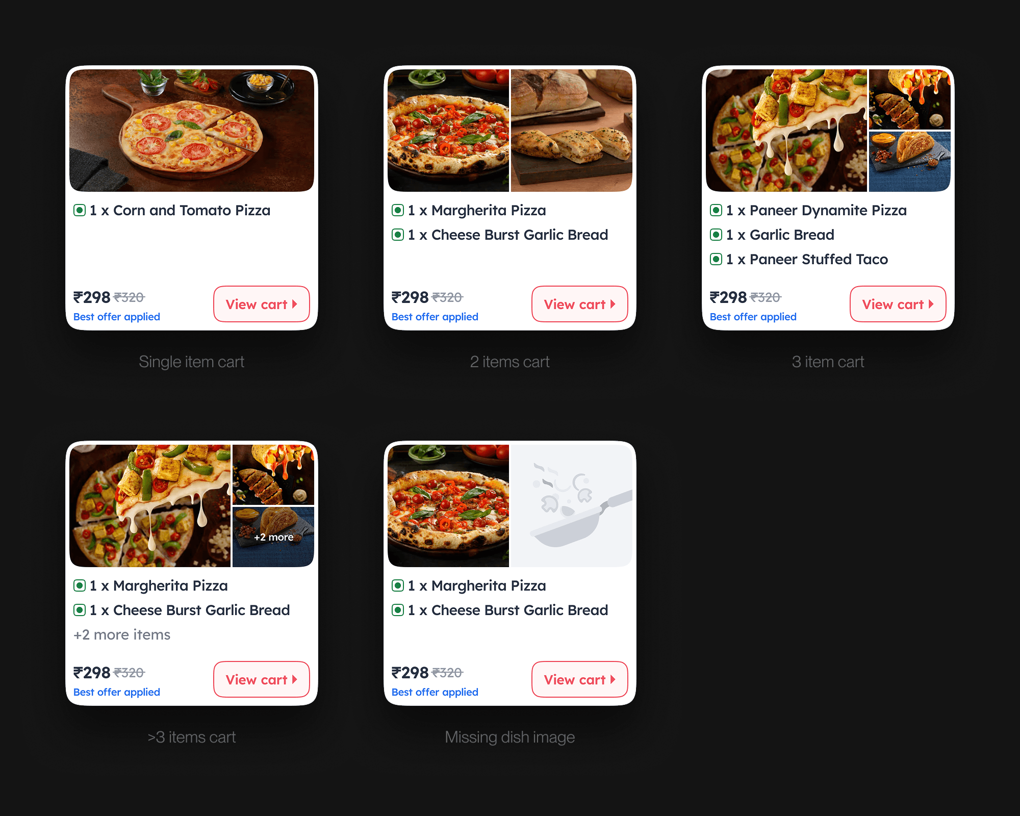
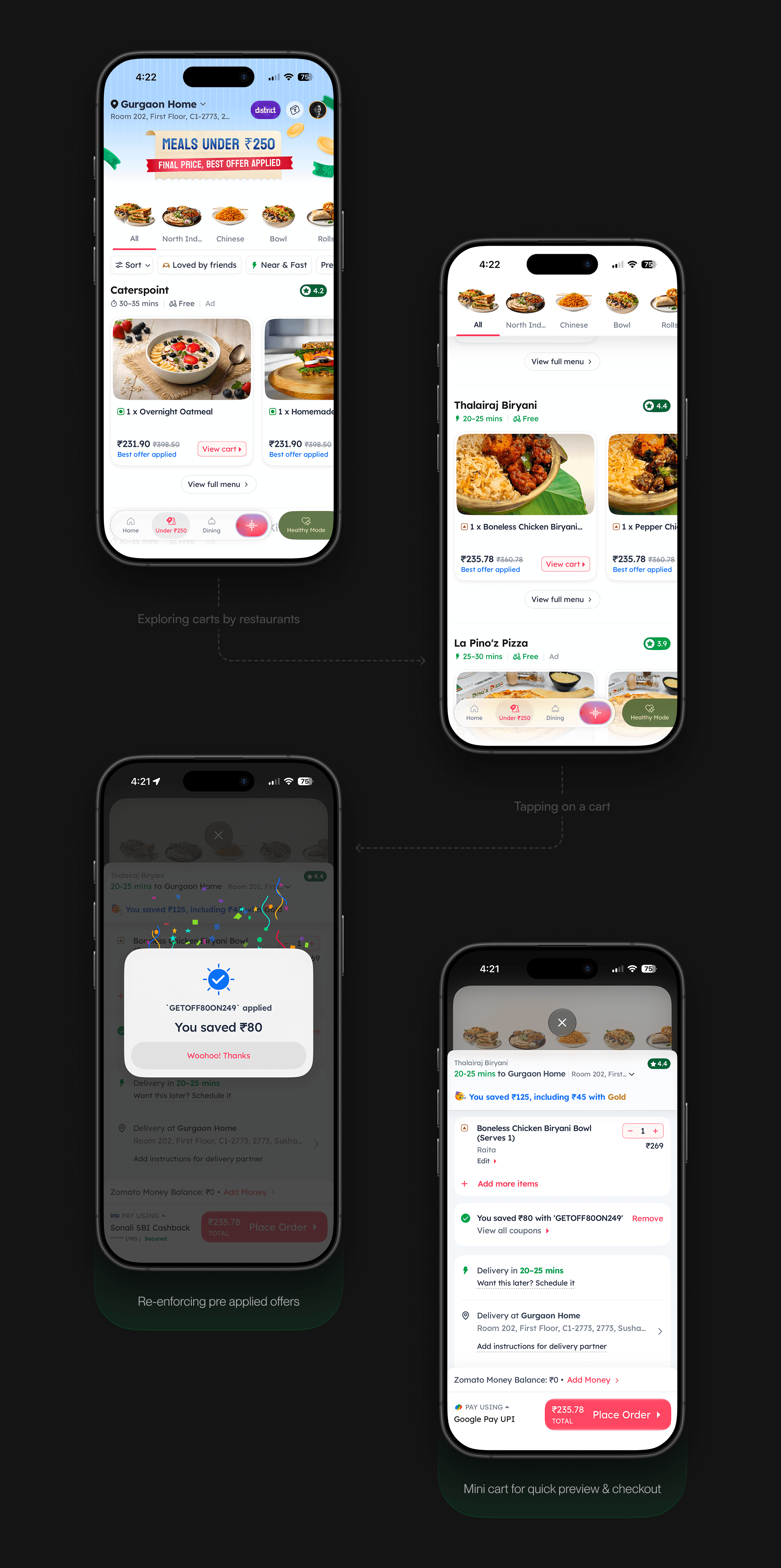
The card had to carry a number users could trust, and prove that trust at a glance. "Best offer applied" is spelled out, because the single all-inclusive price isn't a detail on the card. It's the whole point of it.
The same card also had to flex. A budget might buy one dish or a five-item bundle, so the layout scales from a single item to a multi-item cart with a "+2 more" overflow, without ever letting the price stop being the hero.
Scoping down to ship
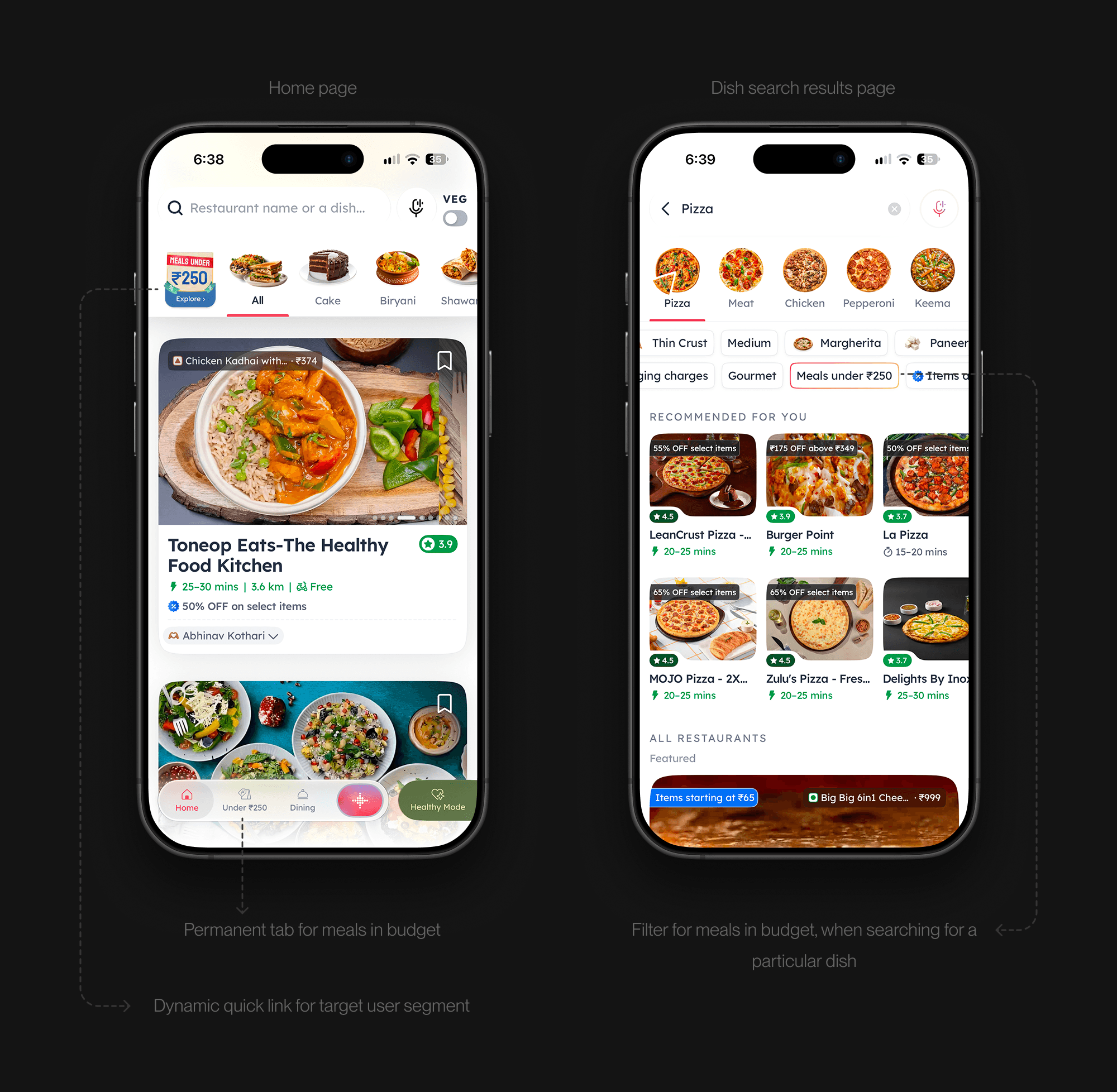
The fuller flow meant a longer build, and we wanted proof the core bet worked before going all in. So we scoped it down to "Meals under ₹X," dropping the manual inputs and letting the platform pick the ceiling based on each user's actual ordering value. The bet stayed the same, but we got it in front of users far sooner.
The problem
Price-sensitive users were dropping off after browsing. Not because nothing was affordable, but because they couldn't tell what they'd actually pay until the very end, once taxes, delivery, fees, and offers were all applied at checkout.
We noticed a clear pattern of cart-hopping. Price sensitive users would open a restaurant, add items, go to the cart, and apply offers, just to see the final total. Then they would do the same at the next restaurant. And the next, creating multiple carts. They were comparing prices the hard way, rebuilding their order again and again until they either checked out from one of the carts or gave up.
The hypothesis was that taking price out as a factor in the decision-making process would give users one less thing to worry about while choosing what to order, making them more likely to convert.
The idea
We wanted to show people complete carts under a set budget, priced exactly as they'd pay with taxes and offers included. The curation had to favour the best value cart that still fit, so affordability wouldn't come at the cost of order value, and if nothing fit at all, the idea was to nudge users up a price band rather than leave them at a dead end.
Set your budget
The first direction was more ambitious. Users would pick their own budget, how many people they were ordering for, and the cuisines they were in the mood for, and we would put together carts that fit all of it. A set-your-own-budget flow, with the customer in full control of the inputs.
Designing the cart card
The card had to carry a number users could trust, and prove that trust at a glance. "Best offer applied" is spelled out, because the single all-inclusive price isn't a detail on the card. It's the whole point of it.
The same card also had to flex. A budget might buy one dish or a five-item bundle, so the layout scales from a single item to a multi-item cart with a "+2 more" overflow, without ever letting the price stop being the hero.
Scoping down to ship
The fuller flow meant a longer build, and we wanted proof the core bet worked before going all in. So we scoped it down to "Meals under ₹X," dropping the manual inputs and letting the platform pick the ceiling based on each user's actual ordering value. The bet stayed the same, but we got it in front of users far sooner.
The problem
Price-sensitive users were dropping off after browsing. Not because nothing was affordable, but because they couldn't tell what they'd actually pay until the very end, once taxes, delivery, fees, and offers were all applied at checkout.
We noticed a clear pattern of cart-hopping. Price sensitive users would open a restaurant, add items, go to the cart, and apply offers, just to see the final total. Then they would do the same at the next restaurant. And the next, creating multiple carts. They were comparing prices the hard way, rebuilding their order again and again until they either checked out from one of the carts or gave up.
The hypothesis was that taking price out as a factor in the decision-making process would give users one less thing to worry about while choosing what to order, making them more likely to convert.
The idea
We wanted to show people complete carts under a set budget, priced exactly as they'd pay with taxes and offers included. The curation had to favour the best value cart that still fit, so affordability wouldn't come at the cost of order value, and if nothing fit at all, the idea was to nudge users up a price band rather than leave them at a dead end.
Set your budget
The first direction was more ambitious. Users would pick their own budget, how many people they were ordering for, and the cuisines they were in the mood for, and we would put together carts that fit all of it. A set-your-own-budget flow, with the customer in full control of the inputs.
Designing the cart card
The card had to carry a number users could trust, and prove that trust at a glance. "Best offer applied" is spelled out, because the single all-inclusive price isn't a detail on the card. It's the whole point of it.
The same card also had to flex. A budget might buy one dish or a five-item bundle, so the layout scales from a single item to a multi-item cart with a "+2 more" overflow, without ever letting the price stop being the hero.
Scoping down to ship
The fuller flow meant a longer build, and we wanted proof the core bet worked before going all in. So we scoped it down to "Meals under ₹X," dropping the manual inputs and letting the platform pick the ceiling based on each user's actual ordering value. The bet stayed the same, but we got it in front of users far sooner.
Impact
The lift was concentrated where it should have been. Promo-sensitive users, the ones the feature was built for, responded roughly three times more strongly than everyone else, which was a good signal that the targeting was right.
Average order value dipped slightly, the expected trade with a budget feature, but GMV per order went up by 0.6% for this segment.
1.6%
1.6%
Order through rate
3.9%
3.9%
Share of platform order value
1%
1%
1%
Average order value
Want to know more?
The full story has more detail than fits here - tradeoffs, dead ends and the stuff that didn't ship. Get in touch for a walkthrough.