Rethinking the menu
ZOMATO · 2024
MY ROLE
Research, Copywriting, High-fidelity prototype, Interaction design, Component & states framework, Quality control
TEAM
1 Product Manager, 1 Visual Designer, Engineering
TIMELINE
May 2024 (1 month)
The problem
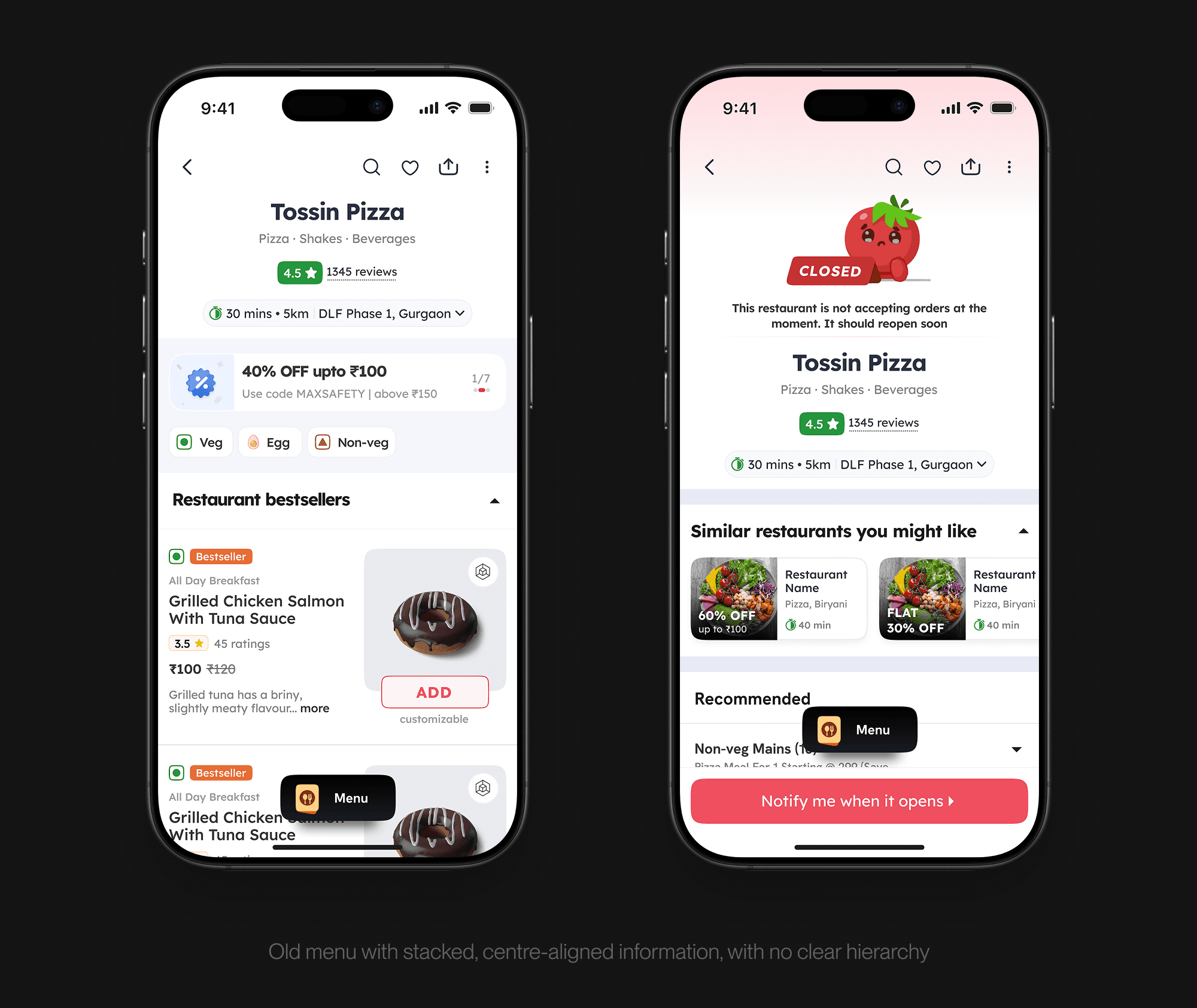
Over time, the top section of the menu had collected a lot. Restaurant name, cuisines, rating, reviews, delivery time, distance, location, offers, and a growing list of contextual states had all been bolted on as new needs came up. The result was a cluttered centre-aligned top section with no clear hierarchy, offers competing visually with the restaurant identity, and dishes pushed far below the fold.
Mapping the states
The other reason the header had grown unwieldy was the sheer number of restaurant states it had to communicate. Serviceability alone had 19 states (closed for the day, closed permanently, closing soon, opening soon, out of delivery range, weather pauses, and so on). Layer on pure-veg restaurants, scheduling availability, IRCTC integrations, outlet switching, and the matrix gets large quickly.
Each of these states had been added over time with its own slot in the header. None of it was wrong on its own, but together they had no system.
The redesign
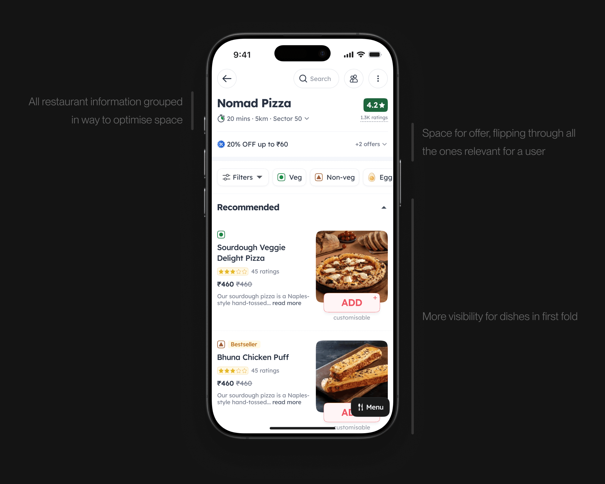
Instead of a header that showed everything at once, we built one that shows only what matters right then. Offers cycle through a single line rather than stacking up as banners. The rest is grouped and ranked, so the most useful thing in that moment gets the space, whether that's a delivery time or the fact that the restaurant is closed.
The old header was centre-aligned, which meant nothing shared an edge and nothing read as belonging together. Left-aligning it let related information group properly and made the block scannable in one pass. The new header ended up smaller in every state, which brought dishes up into the first fold.
Letting restaurants stand out
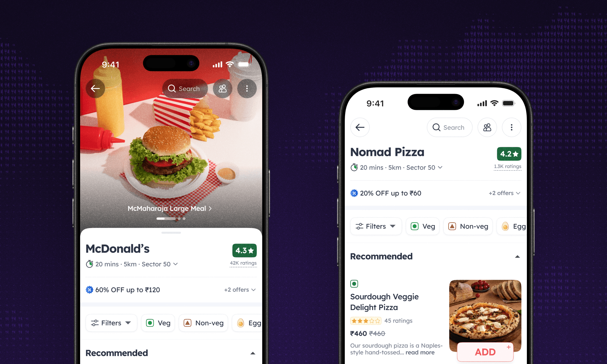
Historically every restaurant menu looked identical, whether you were ordering from a small local kitchen or a well-known chain. The masthead gave each of them a bit of their own space. Their logo sits at the top, and pulling it down reveals immersive videos of their best dishes.

The problem
Over time, the top section of the menu had collected a lot. Restaurant name, cuisines, rating, reviews, delivery time, distance, location, offers, and a growing list of contextual states had all been bolted on as new needs came up. The result was a cluttered centre-aligned top section with no clear hierarchy, offers competing visually with the restaurant identity, and dishes pushed far below the fold.
Mapping the states
The other reason the header had grown unwieldy was the sheer number of restaurant states it had to communicate. Serviceability alone had 19 states (closed for the day, closed permanently, closing soon, opening soon, out of delivery range, weather pauses, and so on). Layer on pure-veg restaurants, scheduling availability, IRCTC integrations, outlet switching, and the matrix gets large quickly.
Each of these states had been added over time with its own slot in the header. None of it was wrong on its own, but together they had no system.
The redesign
Instead of a header that showed everything at once, we built one that shows only what matters right then. Offers cycle through a single line rather than stacking up as banners. The rest is grouped and ranked, so the most useful thing in that moment gets the space, whether that's a delivery time or the fact that the restaurant is closed.
The old header was centre-aligned, which meant nothing shared an edge and nothing read as belonging together. Left-aligning it let related information group properly and made the block scannable in one pass. The new header ended up smaller in every state, which brought dishes up into the first fold.
Letting restaurants stand out
Historically every restaurant menu looked identical, whether you were ordering from a small local kitchen or a well-known chain. The masthead gave each of them a bit of their own space. Their logo sits at the top, and pulling it down reveals immersive videos of their best dishes.
The problem
Over time, the top section of the menu had collected a lot. Restaurant name, cuisines, rating, reviews, delivery time, distance, location, offers, and a growing list of contextual states had all been bolted on as new needs came up. The result was a cluttered centre-aligned top section with no clear hierarchy, offers competing visually with the restaurant identity, and dishes pushed far below the fold.
Mapping the states
The other reason the header had grown unwieldy was the sheer number of restaurant states it had to communicate. Serviceability alone had 19 states (closed for the day, closed permanently, closing soon, opening soon, out of delivery range, weather pauses, and so on). Layer on pure-veg restaurants, scheduling availability, IRCTC integrations, outlet switching, and the matrix gets large quickly.
Each of these states had been added over time with its own slot in the header. None of it was wrong on its own, but together they had no system.
The redesign
Instead of a header that showed everything at once, we built one that shows only what matters right then. Offers cycle through a single line rather than stacking up as banners. The rest is grouped and ranked, so the most useful thing in that moment gets the space, whether that's a delivery time or the fact that the restaurant is closed.
The old header was centre-aligned, which meant nothing shared an edge and nothing read as belonging together. Left-aligning it let related information group properly and made the block scannable in one pass. The new header ended up smaller in every state, which brought dishes up into the first fold.
Letting restaurants stand out
Historically every restaurant menu looked identical, whether you were ordering from a small local kitchen or a well-known chain. The masthead gave each of them a bit of their own space. Their logo sits at the top, and pulling it down reveals immersive videos of their best dishes.
Impact
Menu-to-cart conversion moved in the right direction, though the menu is a busy surface with a lot changing on it, so I wouldn't claim the header redesign alone for that.
The masthead is the clearer result, taken up widely across the platform. Big chains, gourmet kitchens, and small local players all put real effort into it, shooting video content to show preparation style, ingredients, and the story behind a signature dish. A surface built to let restaurants stand out is being used by exactly the restaurants that wanted to.
Want to know more?
The full story has more detail than fits here - tradeoffs, dead ends and the stuff that didn't ship. Get in touch for a walkthrough.